
Equine-X
The Brief
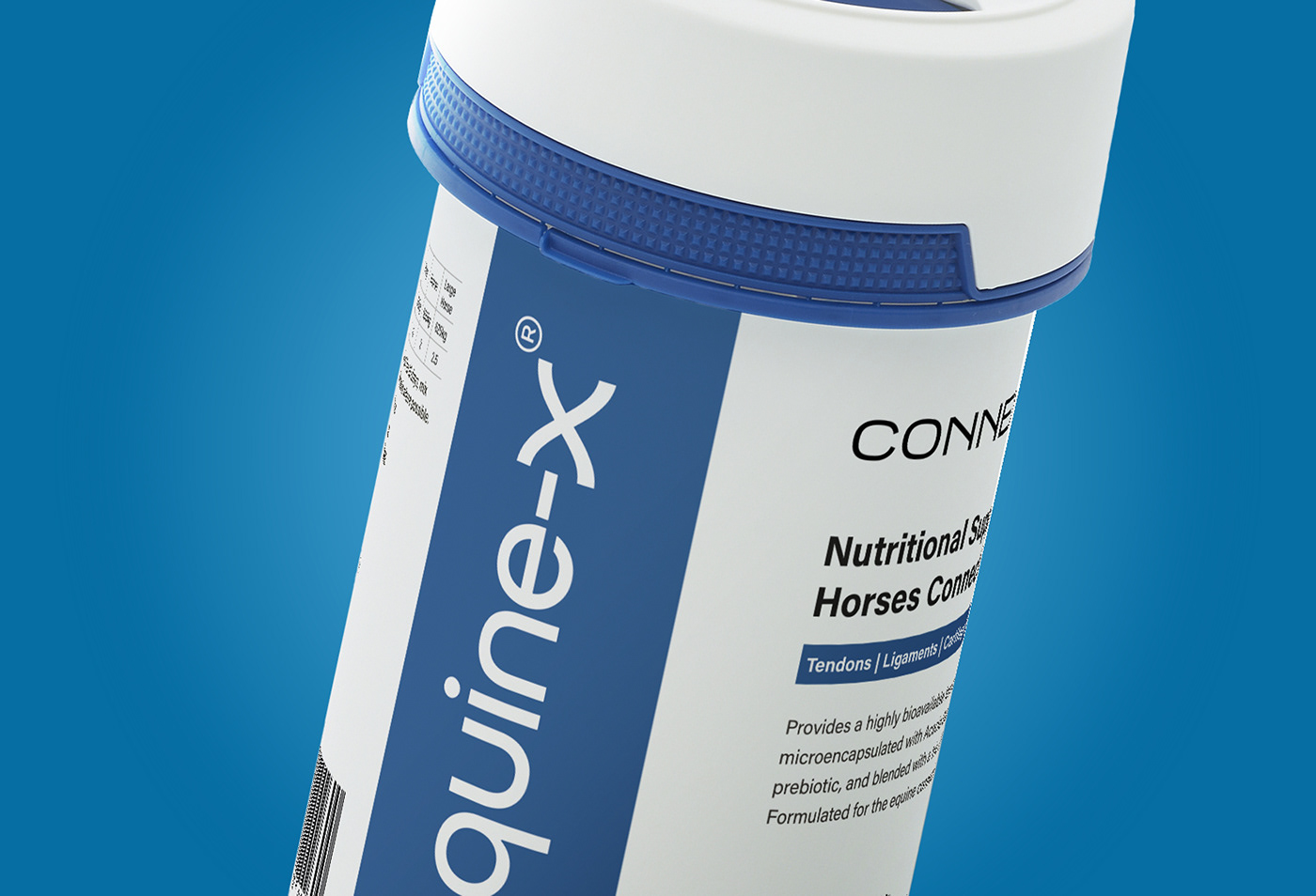
As equestrians and horse owners, we experience all too often the difficulty in finding quality and transparent nutritional support for our horses during times of prevention, maintenance, repair and the athletic demands of training and competition. Each new scenario has led us at Equine-X on a trail of research and on a mission to decipher the science to determine the best options for our horses wellbeing and performance. This has led us to discover emerging ingredients, more optimal levels, better forms, higher bioavailability and the need for discernment in selecting quality sources at every stage of the supply chain.
The result? The creation of premium formulations that we believe in and have worked for us but don’t yet exist in the marketplace and which we are excited to share with other equestrians in a value-for-money and easy-to-understand way.


The Solution
The client wanted the logo to represent the science and most specifically an equestrian link. Working closely with Michael and Claudette, we were able to establish a logo mark that catered both.
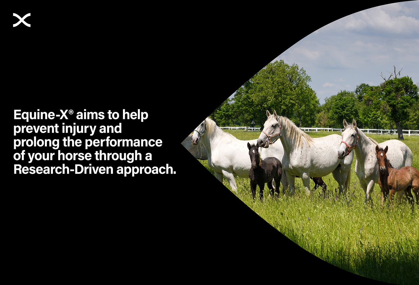
The “X” symbolises the DNA strand which checked the box for science and from that, we were able to extract the shape of a horse’s hoof in the negative space. When this was established, the negative space could then be used as image placeholders and the ‘DNA’ strand could then be used in an identity enhancing pattern.
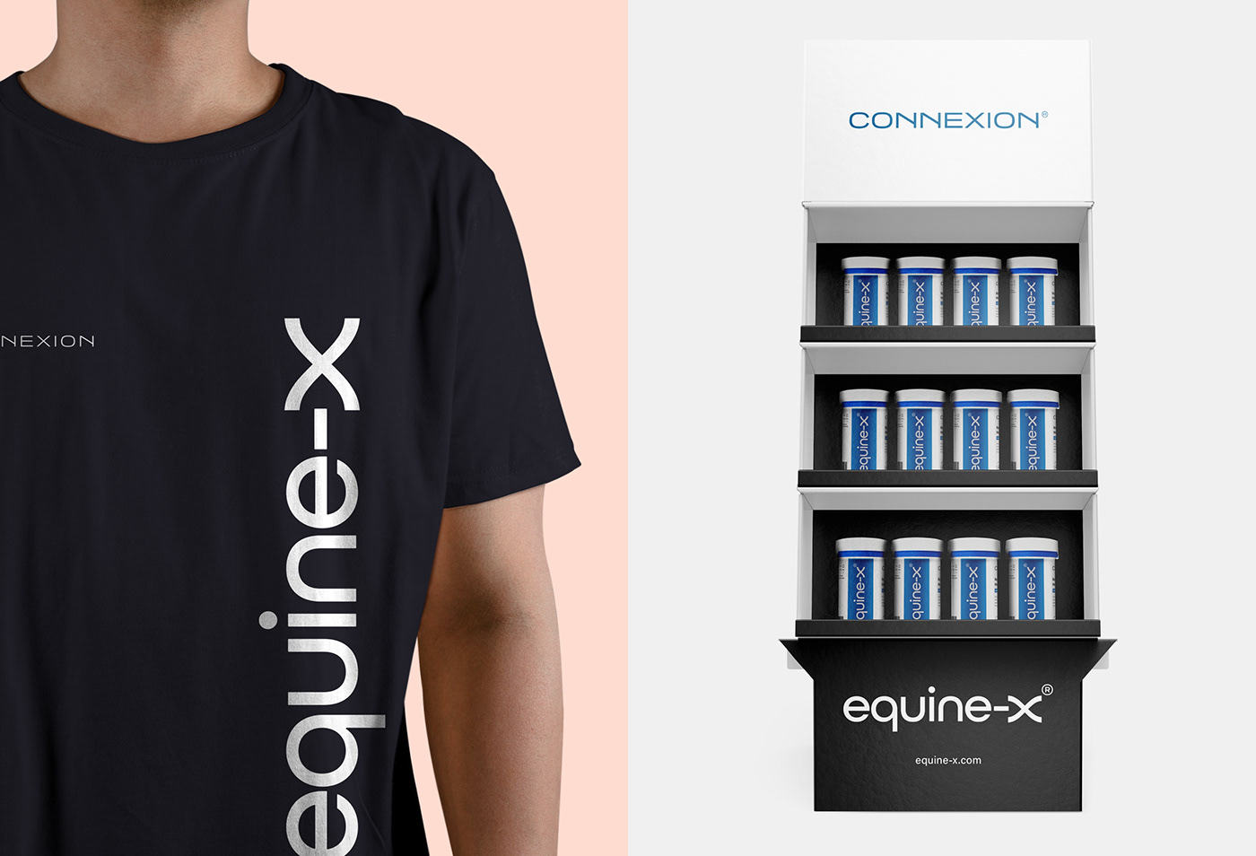
Services
Logo Design
Identity
Website
Print
Digital
Credit:
PurpleSheep
Website: Kyle Gilkinson | Creative Lead: Gary McEneaney | Creative Direction: Martin Lavery


